Sunday, 25 March 2018

Production - Week 4

Production Week 4

This week was short on production as the class had an impending trip from the Thursday through to the weekend. However I did try to get as much work done as I could in the few day at the start of the week. To try and make up for the days I knew I would be losing, I stuck to simpler scenes in the animation that I knew I could get done in under an hour. However, I underestimated the amount of animation needed in some scenes and soon found myself bogged down in the more complex ones. I managed about 8 seconds of animation this week, far less then I had originally hoped for. However, I realized for the time I had, that amount of work was not bad, though I could have managed my time better for a more effective outcome. When I returned on the Saturday night, I was hoping to do some work the following day, however I barely managed to put three scenes together on Sunday. I plan to catch up on the work that is needed to be done over the Easter break.

Sunday, 18 March 2018

Letterhead - Cocnept and Final Design

Letterhead - Professional Practice

Concept

Final


The letterhead changed design as my logo did. The original version was loud and did not seem to flow well in terms of layout. The updated version was designed to be simpler and easier to read, and to also not obstruct the letter itself.

Final Business Card

Finalised Design - Business Card

Front


The finalised front was tweeked a little bit in terms of colour, but overall remains the same. The background was toned to a paler teal shade while the character was given the red outline in order to contrast between the two.

Back


As with the front, the back of the business card stayed relatively the same in terms of the layout. However the back was changed to a light shade of the red/coral to allow the text to blend more.

Final Logo Design

Finalised Design - Logo

The final logo design was inspired by japanese ink drawings, in that the text is a quick handwritten sigitaure written in ink. The character outline came from the business card and was given a darker outline to stand out more.

Additional Logo - Letterhead

The text based logo was designed for the letterhead as the original logo lost much of it's detail when it was shrunk down to fit to the letter. Instead of the character outline, the initials replace the drawing and the services offered are taken from the business card and placed at the bottom.

Saturday, 17 March 2018

Production Week 3

Production Week 3

This week was spent getting as much of the line work as I could as I would be away next weekend for the Dingle Animation Festival. It proved to be my most productive week so far as I managed to meet my 20-second quota for this week and also get some of the work I was behind on from the previous week. I quickly set into a routine at the beginning of the week in terms of the workload, pacing myself in order to get the 4-seconds of animation needed for the day and whatever time was left over in the day was used to tackle the work from the previous weeks. I also took making sure that the files from the animation were organised properly and titled like we were shown some weeks ago to keep better track of them. On top of that I have also began adding the scenes that are near completed to the lock-in animatic so as I can see how the animation is playing out.


Friday, 16 March 2018

Business Cards - Colour Variety

Business Cards - Colour Concept

Front


The first two images where are the earliest layout test I had done and while it went with the whole fluid sketchy style I was trying to achieve, I could not apply the colour contrast I was hoping for. The next two are examples of when I abandoned the paper-like background and instead went for a flat coloured background. Doing so allowed me to play with tone and colour, especially on the character outline and the text.

Back


The back shared the layout as I was happy with that, however I was undecided on whether to go with the same colour on either side of the card or try a two tone card.

Logo Design - Colour Variety

Logo - Colour Design


I tried looking at the colour palette I employed in my business cards, however I noted that because of the small scale of the image, the blue hue only made the character harder to see. Instead I tried a black outline with a drop shadow for definition, though I may get rid of the shadow as it seems to almost give the image a blurred effect.

Wednesday, 14 March 2018

Logo and Business Card - Character Design

Character design

Concepts


Several hand-drawn character designs that I had no love for. I struggled to settle on a design I liked as I was trying to be too cartoon-y in my style. I tried using digital instead and after several tries I settled on three designs.

Final Designs


Monday, 12 March 2018

Interim Presentation

Updated Animatic

While adding the animated scenes into the existing animatic, I also added additional sound effects and clips.


Business Card - Fonts and Layout Concept

Business Card Concept

Business Card Layout Ideas


Character based business cards often had the character consume the front of the card and at first it was something I was going to try, but eventually I realized that as I wanted to be a 2D Character Animator, I needed to showcase a character in motion rather than simply showing character design.


I started to look at the sketchy hand-drawn style and found that it could show a character in fluid motion and would also suit my rather detailed style. The last image is also what I wanted the colours to play out as; that water colour effect or even the pale, pastel colours that I could incorporate into the business card and logo.

Font


Fonts play a major part in a business card as they can either bring out a card or completely throw off the entire thing. For the card, I wanted to follow that hand-made feel of the character and go with a handwritten style instead of the generic fonts found online.

Sunday, 11 March 2018

Production Tracking

Production Tracking Sheets

Before we began production on our degree films, the class was handed a Production Tracker and filled it out. The production sheets are used in order to keep track of our schedule and to apply our time accordingly. The sheets are dedicated to various aspects of the production, such as asset tracking and animation tracking, that are controlled via preset dates that we set out for ourselves.

Over Schedule 

This sheet is the main sheet used in tracking what needs to be done at what point in the production schedule. It is in this sheet that the aspects of pre-production, production and post-production are sorted and outlined using different colour coordination so that I can follow them more easily. The sheet is the overall tracker for my production and allows me to see what needs to be done that month.


Asset Tracking

Assets are the aspects of the film that are animated or are placed within the actual animation. The tracking sheet is used to keep check of what assets are finished and need to be completed.


Animation Tracking

The sheet comprises of the number of animation scenes in the whole film and the seconds they hold. The animation tracking sheet allows me to mark off W.I.P and finalized animation which is shown in the progress Sheet.


Progress Chart Sheet

This sheet is the foremost important aspect of the production tracking as it provides an overall look at the progress of the production schedule and features a countdown of the number of days left for the animation and other aspects.


Saturday, 10 March 2018

Production - Week 2

Production Week 2

This week has proved to be more productive than last as I have managed to meet my quota of 20 seconds this week, only because of last week's minimal production. A slight setback occurred at the beginning of the week in which I found I was once more missing two backgrounds I needed for the opening scenes of the animation. I could not find it among my files and had somehow managed to delete the original layered art file and so sent an additional several hours finished them off. I have however, managed to finish the animation for the first few scenes to a reasonable standard in that they are much easier to flow, though most of it is of yet still uncoloured. I finally feel I am getting back into the flow with Toonboom as I managed to produce three scenes in one day near the end of the week. Though looking at the opening few scenes, I am tempted to remove two scenes from the beginning as to me they seem to play little part in furthering the scenario or the story. I have once more gotten into the flow of animation, however I plan to be more productive in this coming week.


(Sudden Pain; The mother is hit by the thrown bowl of food and is burnt.)

Logo Design Ideas

Logo Design - Ideas

I plan to use warm and cold colours in the development of my logo. I was advised to use a character instead of portraying myself and that is something I plan to do as part of this section.

Character Design


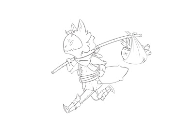
Character wise I am looking at strange humanoids and monsters instead of the normal portrait of a person I have on my original business card. I am intrigued by the idea of a flat, 2D character and colour scheme. 

Friday, 2 March 2018

Production - Week 1

Production Week 1 

The production of my animation began on the 26th of February with the intention of going straight into scene preparation and keyframe animation. However, the main animation was put on hold for an additional three days as my backgrounds where not completely finished and needed to be done in order to finish the scene preparation beforehand. Animation began on the Thursday three days behind schedule due to the backgrounds and further complications where faced that resulted in on 8 second being complete this week instead of my expected 20 seconds that I would need to get done in order to reach my quota for this week. Another key problem I noted was that, having not animated with Toonboom in several months, I struggled to remember what tools where which and even the shortcuts for them. However, I have finalised my backgrounds and have begun keyframing the animation for the first four scenes in the opening. I have decided to begin with the easier scenes that require little animation in them, this included the establishing shot that only required a trucking pan and still frame scenes. I am hopeful that I can make up for the additional seconds I failed to do this week in the second week of production.

(Hallway shot; Though one of the long scenes, this shot is mostly a pan-in on the door.)

(Introduction; This scene ends with the introduction of Creak, the main character of the story.)